Visualizing data is a great way to both derive insights and to validate the quality of a data set. There are a number of ways to draw plots in Python. Two of the popular libraries we use are: Matplotlib: a
Hamid Mokhtarzadeh
Hamid is Principal Navigation Engineer at Organic Navigation and has expertise in sensor fusion, navigation systems, and custom engineering software tools.
Accelerometer: Zero-g Offset Temperature Coefficient
Accelerometer: Zero-g offset Temperature Coefficient Other Names bias thermal drift, offset temperature slope, offset or bias thermal response Examples Device Name Value Honeywell HG1120BA50 Bias Repeatability is given over both time and thermal conditions NA CTi Sensors CS-IM100 Bias change
Accelerometer: Zero-g Offset
Other Names zero-g or 0g offset, bias, bias repeatability, turn-on to turn-on bias, zero-g output Examples Device Name Value Honeywell HG1120BA50 Bias Repeatability, at any given time or thermal condition 16mg, 1$\sigma$ CTi Sensors CS-IM100 Zero offset error, at
Accelerometer: Full Scale Range
Other Names Full scale range (FSR), input range, dynamic range, measurement range, operating range Examples Device Name Value Honeywell HG1120BA50 Operating Range -16 to 16g CTi Sensors CS-IM100 Range selectable ±2, ±4, ±8g This is one of the more straight
Inertial Sensor Performance Parameters
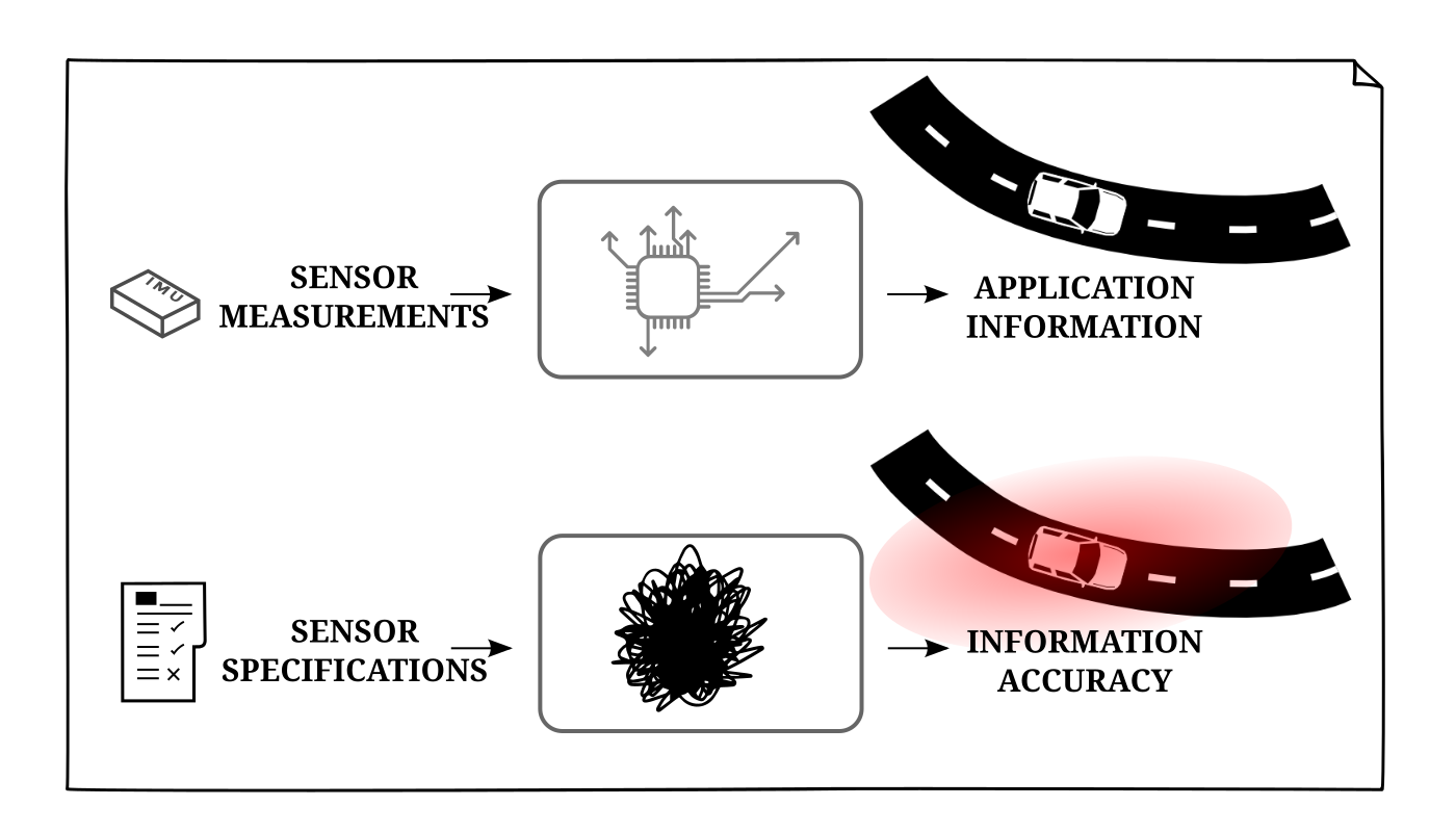
Navigation systems rarely have the benefit of directly measuring the information desired. The same can be said about the utility of navigation sensors. The desired state may be the position and terrain slope, but what is measured in simply the
Reference Data Sets
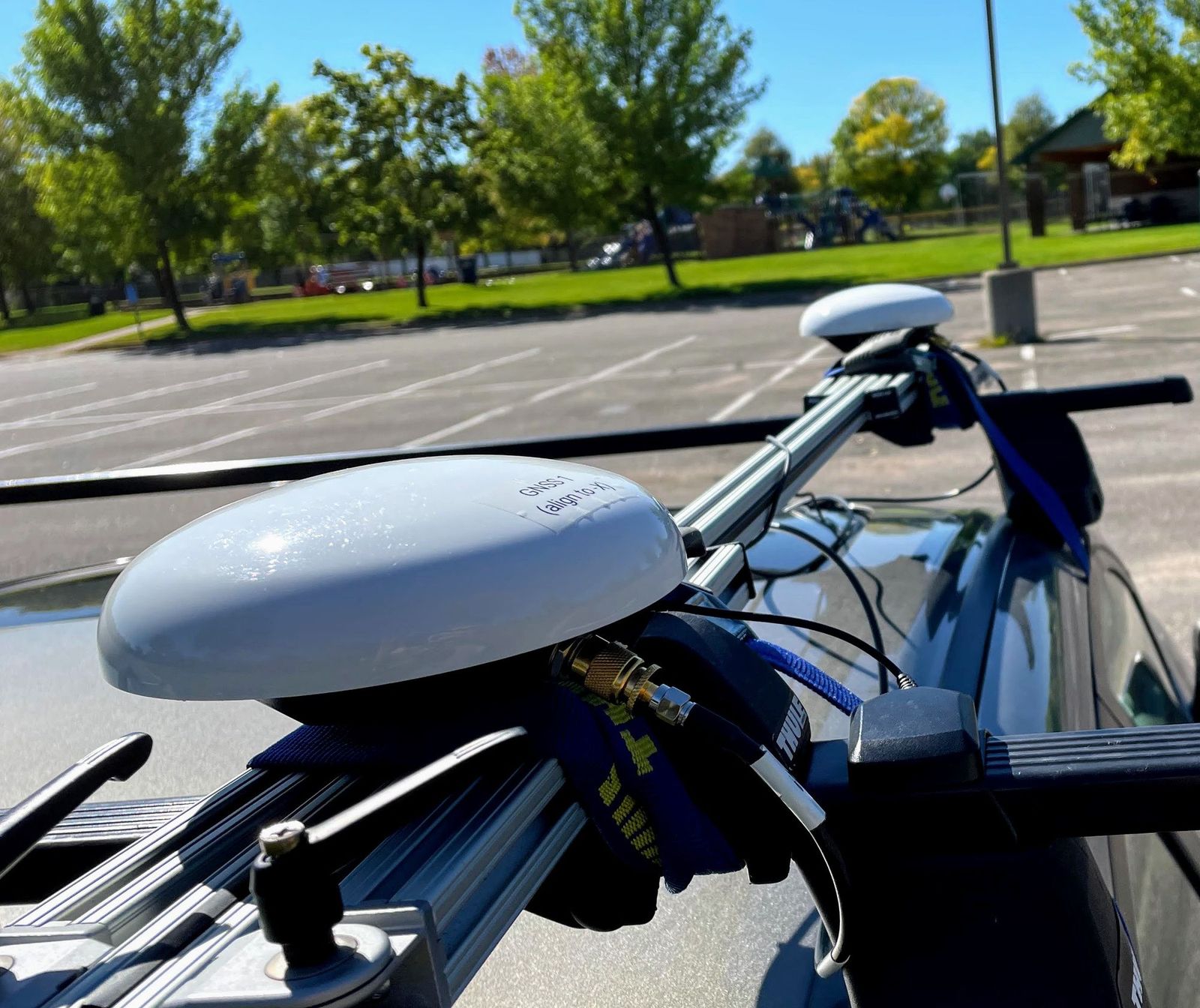
A fair amount of iterative testing goes into developing interconnected guidance, navigation, and control systems. While nothing can replace the insight that comes from testing the interconnected system, actual algorithm development for each sub-system is better done in isolation. For